
Five days of product decisions
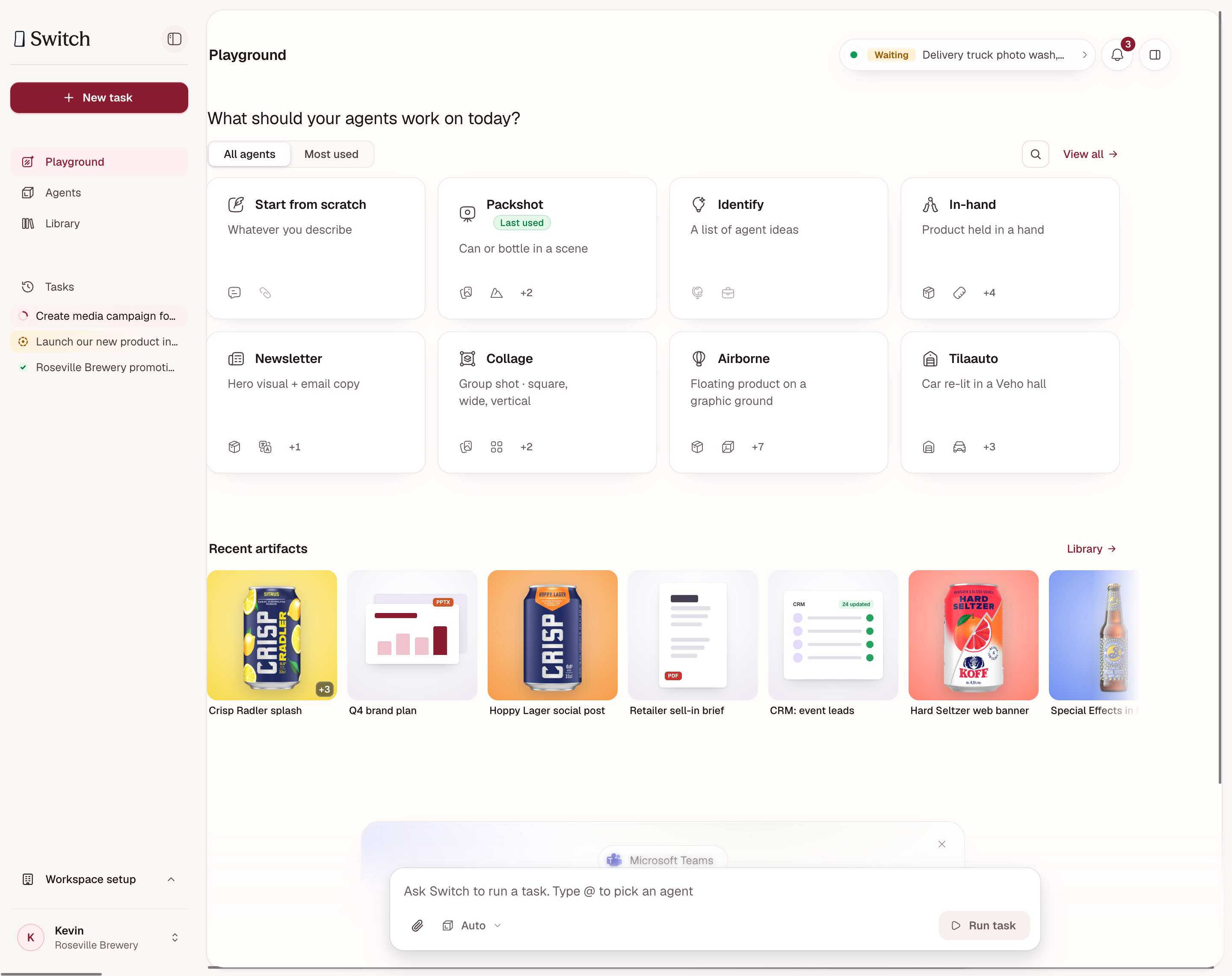
I redesigned an AI agent workspace with the founder and engineering lead, moving from a crowded dashboard to a simpler Playground with detail on demand.1
This case records the decisions and tradeoffs behind the home and main task workflow. Supporting screens, reviews and handoff work continued after the five-day sprint.
Project snapshot
Problem
Brand managers had to navigate duplicate agent lists and scattered activity to start work and find results.
Solution
A simpler Playground, an activity monitor and a workspace for preparing a brief, reviewing results and requesting changes.
Impact
A simpler Playground and main task workflow, reviewed with the founder and engineering lead. Supporting screens and handoff work continued after the five-day sprint.
- Role
- Lead product designer · Independent consultant
- Timeline
- 14–20 October 2026 · Five-day sprint; further reviews through at least 22 October
- Partners
- Founder and engineering lead · Sole designer
- Ownership
- Product structure, interaction design, UI system, prototype and handoff
A brand manager’s first task
Switch lets companies give tasks and files to AI agents and receive imagery, documents or presentations. We were designing for brand managers with little AI experience. They were trying the agent before briefing an agency and needed a result they could use.
The interface had duplicate agent lists, scattered activity and results that were hard to find. I owned the redesign, working with the founder and engineering lead. We spent five working days on the home and main workflow, then continued with supporting screens and reviews.
I drew on the platform walkthrough, engineering documentation, six meeting records from 14–22 October and the team’s account of customer usage. We had no new usability study or post-launch measurements.
01 / A simpler Playground, with detail on demand
At kickoff we considered separate work and control modes. At Checkpoint 1, we chose one home with relevant agents, ongoing work and completed outputs.
On 16 October, we still preferred a richer view. But runs, insights and artifacts competed below the search bar. Putting them in separate panels helped organise the page; we still needed to decide what a new user should see first.
At the 19 October review, we narrowed the home to two jobs: start work with an agent and retrieve the deliverable. We reduced recent runs to two or three compact items. By 20 October, we had chosen a simple day-one Playground with an optional advanced sidebar for experienced users.
Choosing the default home
Prioritise first use or show the full system?
Richer home
Pros
- Activity, insights and results visible together
- More context for experienced users
Cons
- Too many elements competed below the search bar
- Higher cognitive load for a first-time brand manager
Simple Playground with an optional sidebar — Chosen direction
Pros
- Prioritise starting work and retrieving deliverables
- Keep deeper information in an optional sidebar
Cons
- Detailed status takes an extra step to inspect
- Background work still needs a persistent signal
On 16 October, we preferred the richer view. By 20 October, we had chosen a simpler default with detail available on demand.
Inside a task, Settings, Preview and Insights give users access to supporting information while they work.
Settings, Preview and Insights on demand
Settings sidebar showing the task brief and output samples
Inspect the task inputs in Settings.
Preview sidebar clearly labelling example output as samples before generation
Preview labels the examples as samples before generation starts.
Insights sidebar showing a not-started state and an empty content-produced panel
Open Insights to see usage details. Credit numbers are prototype examples.
Moving detail into the sidebar added a step for anyone checking status. We kept requests needing attention visible and added a persistent activity signal.
We moved reports and connections toward administration and settings.
Discover agents by what they produce
Agent discovery grouped by visual content, campaigns and copy, and planning
Browse agents by output. Create a reusable agent through a separate flow.
I separated the reusable agent setup from each task and its deliverables. At the later review, we chose “Task” for a run: using an agent with new inputs creates a task.
Agent, task and deliverable
Agent
A reusable setup with instructions, inputs and expected outputs.
Company-shared setupTask
One run of an agent, with its inputs and conversation.
Personal workDeliverable
A result file stored in the Library.
Shared result
The engineering documentation described personal conversations and shared files. We could show colleagues’ deliverables from Library. Showing their live tasks would need new backend capability; a navigation change could not grant that access.
02 / Keep background work within reach
On 19 October, we chose a small persistent indicator that would open task details. Users could check background work while starting another task or finding an output.
Activity monitor decisions
Add a persistent activity indicator
19 October · Checkpoint 3Keep a small signal visible during background work. Open it to inspect task details.
Keep attention requests visible
20 October · Checkpoint 4Show work needing attention on the simpler home. Let experienced users open the advanced sidebar for more detail.
Separate running work from notifications
22 October · Checkpoint 5We called for separate live-activity and notification tabs across Playground, Agents and Library. Running tasks and alerts need different treatment. Implementation is unconfirmed.
Live activity shows running tasks. Notifications cover alerts, received shares and connection requests. Combining them could bury a request among processing updates. We wanted access to both while browsing Playground, Agents or Library.
Open the monitor to inspect background work
Expanded live-activity popover with Running, Needs you and Done counts and task links
The activity indicator opens task counts and links, including work waiting for an answer. These are sample counts. This export shows a separate notification bell; it does not show the proposed two-tab view.
The recent export shows the monitor open, with counts and links for work needing attention. It has a separate notification bell. I have not verified the proposed two-tab interaction or its production implementation.
Name the action and the next step
Use Working, Needs you and Done to distinguish active work, a pause and completion. Show a percentage when the system can measure progress. For image generation, the design uses a state and elapsed time.
The platform supported live events and Working, Needs you, Review, Done, Stopped and Failed states. I used these to distinguish active work from a pause and explain what the user needed to do next.
Retrieve shared results
Recent Library design showing deliverables grouped and filtered by file type
Filter deliverables by file type. Shared files and personal conversations have different access rules.
03 / Ask enough to get the brief right
My early aim was to minimise questions before generation. Engineering pushed back: missing details could mean generating the image again. I changed the goal to asking enough to produce a useful result, while reusing known facts and showing defaults.
I separated input checks before a model call from questions about orientation, palette or target medium. We accepted some preparation effort to avoid rework. We still needed to confirm support for recognising the wrong product in an uploaded image.
The engineering analysis reported follow-up corrections in a small customer sample, mainly about art direction. I put conversation and result in one workspace and removed the intermediate popup from the proposed flow. Users could request a change or download a good first result.
Prepare the brief, then review the result
Choosing an effect while the task brief builds in the Settings sidebar
Choose the effect before generating. The brief and sample outputs stay beside the conversation.
Ready result beside the conversation, completed brief and a prompt for changes
Review the result and request changes in the same workspace. The artwork illustrates the layout; I have not verified its fidelity to the brief.
We dropped the fixed three-variant requirement to prioritise quality. I kept download resizing separate from generating a new composition. Image follow-up regenerated the output, so the controls had to avoid promising a precise edit or version restoration.
Download the formats selected during setup
Expanded result canvas with file-type choices and Feed post and Story or Reel download sizes
Choose a file type and the sizes selected during setup. Approval and sharing controls show proposed interactions; backend support needs confirmation.
Scope and remaining decisions
We deferred the node-based workflow visualizer on 19 October to keep time for the main delivery flow.
Customers had asked for human approval. The platform supported approval of a paused tool call by the person who started it; colleague artwork sign-off needed further work. The prototype’s approval control remained a proposal.
At the 22 October review, the founder proposed applying each customer’s brand colours. I raised the difficulty of maintaining contrast and proposed a neutral base with selected brand accents. We had not settled the compromise or measured its effect.
Login and invited-user onboarding
Burgundy Switch login screen with Google and work-email sign-in
The login page introduces campaign imagery as an example of the work Switch can do.
Invited-user onboarding asking for role and AI experience
Ask for role and AI experience to tailor the start. The lower-left panel contains prototype controls.
Delivery and next validation
I used the existing tokens and components, kept a capability record and built the prototype with Claude. I made the design decisions and checked generated copy against platform constraints.
The five-day sprint established the home and main workflow. At the 20 and 22 October reviews, we still had supporting UI, onboarding, sharing and handoff work to finish. Production rollout and customer outcomes remain unconfirmed.
Next, I would test whether a new brand manager can complete a task with the advanced sidebar closed, notice a request for input, refine the result and retrieve it later.
Footnotes
-
Based on the walkthrough, engineering documentation and six meeting records from 14–22 October 2026. We ran no new usability study; production rollout and customer outcomes remain unconfirmed. ↩