Context- Where it all began
How I turned Smartly’s ML ad-automation from underused to core offering by designing what the system decides on its own, and where humans stay in control. Sole design owner, two acts.
This was the first and longest-running project I owned at Smartly.io. Campaign automation via triggers was one of the platform’s powerful feature which was used well by saavy users for a better ROI, but poor adoption and most complaint about by most users.
The system had been built 7 years earlier. While the paid social ecosystem evolved rapidly across Meta, Snapchat, Pinterest, and TikTok, our automation layer remained structurally unchanged.
-
Despite the feature’s underlying power, adoption among new customers was declining.
-
The impact was visible across multiple signals.
-
Existing users generated increasing support load, largely due to edge cases and experience inconsistencies that required institutional knowledge to navigate.
-
Most concerning, our most advanced users, the ones operating at scale were expressing sustained frustration with structural limitations.
At the same time, Smartly.io was expanding into multi-channel orchestration. That strategic shift surfaced a more fundamental issue: the automation architecture was not designed to scale across channels or accounts in a sustainable way.
This was no longer a matter of usability refinement and required deliberate strategic design reset.
Problem — A System Out of Sync
The automation experience suffered from a fundamental misalignment between user expectations, system architecture, and product ambition.
For advanced users managing large-scale accounts, automation felt restrictive. Triggers were account-bound, logic was rigid, and scaling required repetitive cloning. Instead of reducing effort, the system often created operational overhead.
For newer users, the problem was different but equally damaging. Setup felt complex, navigation was disorienting, and feedback loops were weak. Users couldn’t easily see what automation executed or why — eroding trust early.
Underneath both experiences sat a backend architecture that constrained meaningful UX evolution. This was not a surface-level design issue. It was a systems problem.
Stakes: Why This Required Attention!
Automation touches the core value proposition of Smartly.io: efficiency, control, and scale.
If we failed to evolve it, the risks were tangible:
-
New customers would default to native ad tools
-
Power users (“champions”) would lose advocacy energy
-
Support costs would continue to rise
-
Multi-channel expansion would lack operational depth
In short, automation needed to move from legacy burden to scalable platform capability.
My Role - Product Design Experience Owner
I owned the end-to-end experience vision for automation — across workflows, interaction models, and long-term direction.
My responsibility extended beyond interface redesign. I drove the project with keeping focus to align architectural ambition with product reality.

Problem reframing grounded in data and user insight

Alignment workshops with Product and Engineering
Definition of ambition vs. feasibility boundaries

Validation strategy and prototype testing

A forward-looking UX direction that anticipated multi-channel needs

continuous partnership with PM, engineering, leadership, and customer-facing teams.
User archectypes :
-
Propeller Heads (Performance Marketing Experts)
Highly experienced marketers operating at scale.-
Comfortable with complexity
-
Deeply metric-driven
-
Expect automation to save time—not create overhead
-
-
Modern Marketers (Aspiring Specialists)
Growing professionals focused on learning and speed.-
Prefer clarity over flexibility
-
Default to native tools if complexity feels unjustified
-
Sensitive to early friction and poor feedback loops
-
The redesign had to serve both—without dumbing down or overwhelming either.
Design Approach — Reframing Before Redesigning
Before proposing solutions, I focused on understanding structural constraints and behavioral patterns.
We began with a deep diagnostic phase: analyzing support tickets, reviewing bug backlogs, and evaluating usage across cohorts. I intentionally approached the system from a platform-agnostic lens — asking what modern automation should look like if we were building it today.
State of the legacy workflow
From there, I facilitated multi-week alignment sessions with PM and Engineering. One of the most important outcomes was explicit clarity around what we would not solve in phase one. This prevented incremental patchwork disguised as progress.
Validation followed in layered stages — iterative prototypes, alpha releases with selected customers, and tight feedback loops with Sales and Customer Success.
Design Approach
We began with a deep diagnostic phase: analyzing support tickets, reviewing bug backlogs, and evaluating usage across cohorts. I intentionally approached the system from a platform-agnostic lens — asking what modern automation should look like if we were building it today. As a result this was a research-heavy, systems-level redesign, not a UI refresh.
Validation followed in layered stages iterative prototypes, alpha releases with selected customers ranging from Zalando, Spotify, fartech, etc, and tight feedback loops with Sales and Customer Success. This was not a sprint. It was more of a controlled reset which helped us navigate with clarity and confidence on building the right thing.
Key Decisions
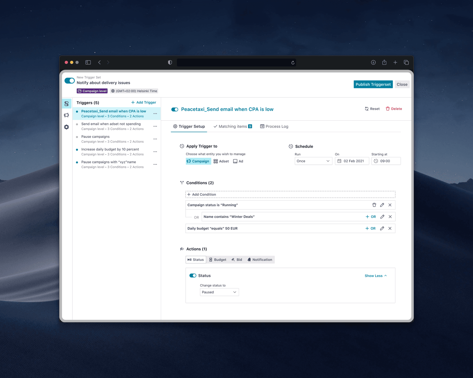
From Fragmented Tool to Scalable System: The redesigned experience introduced a clearer structural model built around Trigger Sets — a grouping mechanism that reduced cognitive load and enabled logic reuse across accounts and channels.
First, we rejected incrementalism. Minor UX improvements would have preserved legacy architectural constraints. Instead, we proposed a full redesign grounded in future scalability. Even though it required heavier engineering investment and a longer timeline.
Second, we secured alignment to introduce a new trigger engine. This backend service enabled cross-account and cross-channel automation, advanced scheduling logic, and decoupled future UX decisions from legacy dependencies. Without this shift, the experience would remain structurally limited.
Third, we re-anchored automation in reporting — the user’s mental home base. Instead of forcing users to navigate into a separate automation area, trigger creation could originate from performance views, reducing cognitive load and context switching.
Proposed Product workflow
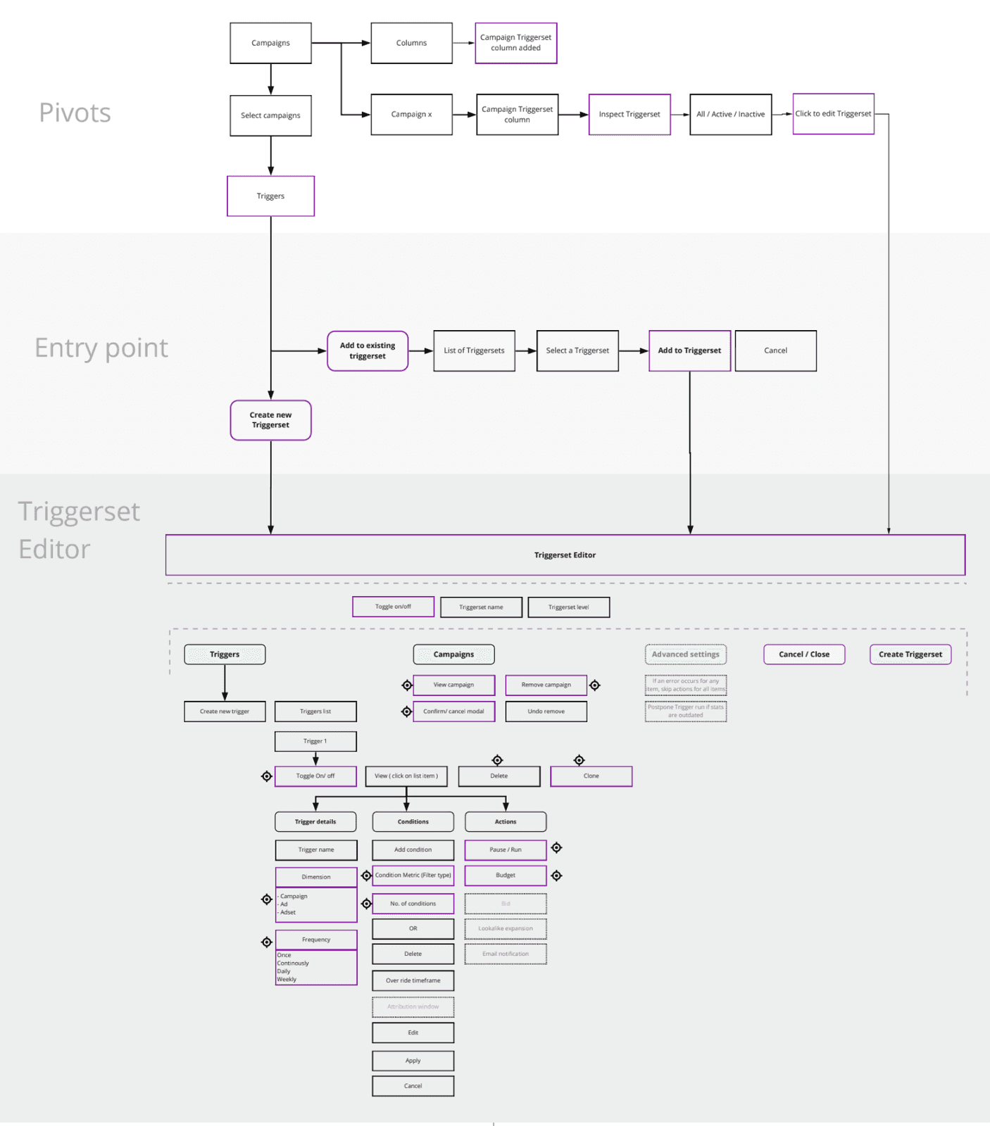
Finally, we made usability debt explicit. Some refinements were deferred due to OKRs and capacity, but they were documented and tracked intentionally. This prevented temporary compromises from becoming permanent limitations.
Solution Overview:
High- level diagram on Redesigned- concept navigation compared to the older version.
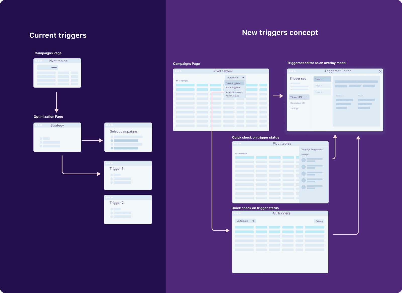
Cross-account and cross-channel automation eliminated repetitive setup work. Templates supported onboarding without constraining advanced logic. Activity visibility was fully integrated, allowing users to see what automation executed and why.
The interface itself was simplified: clearer hierarchy, modular components, and focused layouts. Several of these patterns were adopted into the broader design system, extending impact beyond this feature.
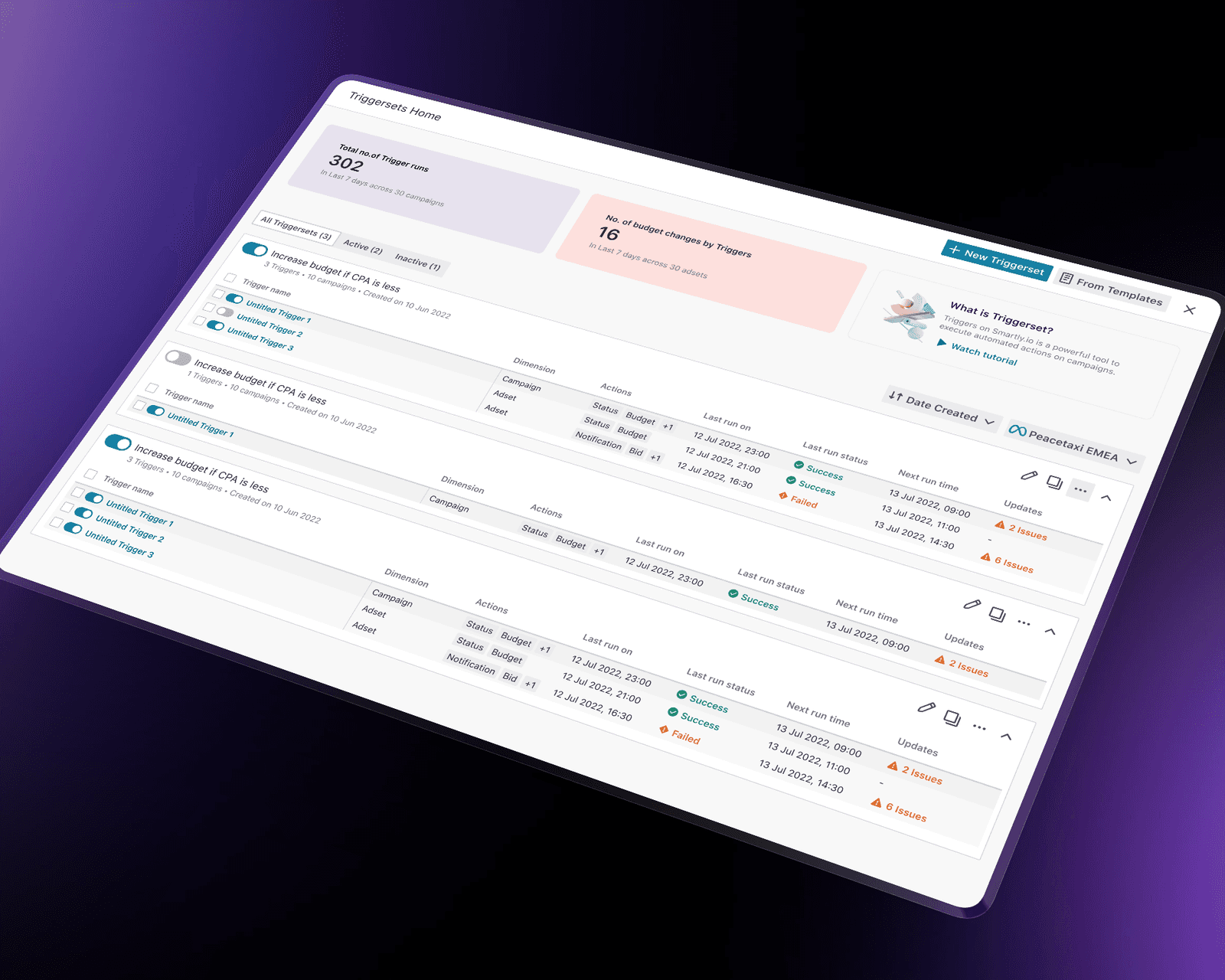
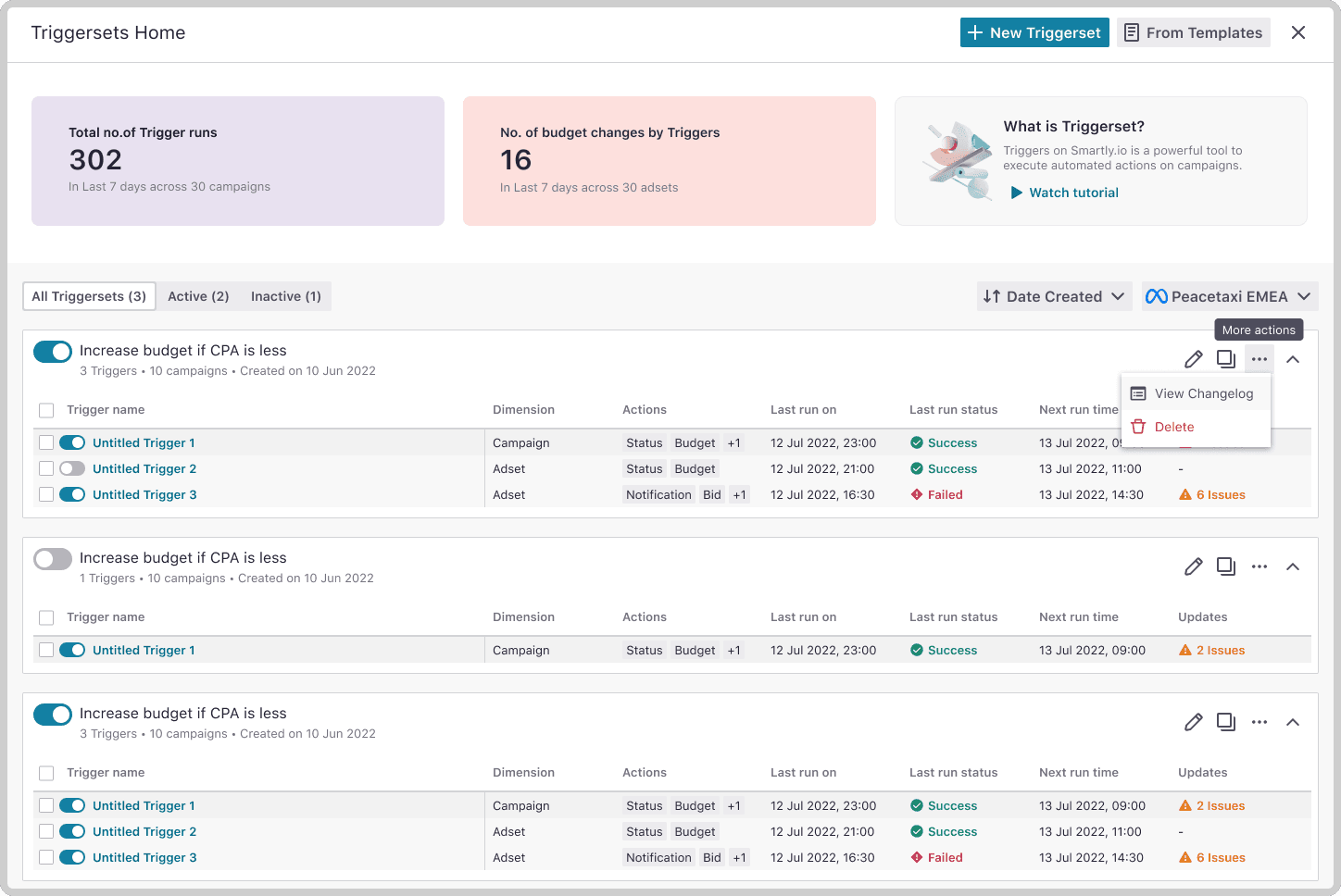
- Triggersets Home:
Refined UI & navigation, Focused layouts, clearer hierarchy, and data-driven components
-
Integrated activity visibility:
Users could finally see what automation did and why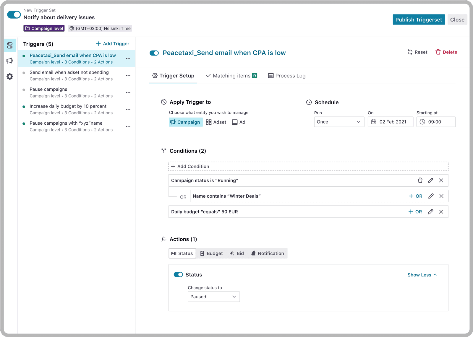
-
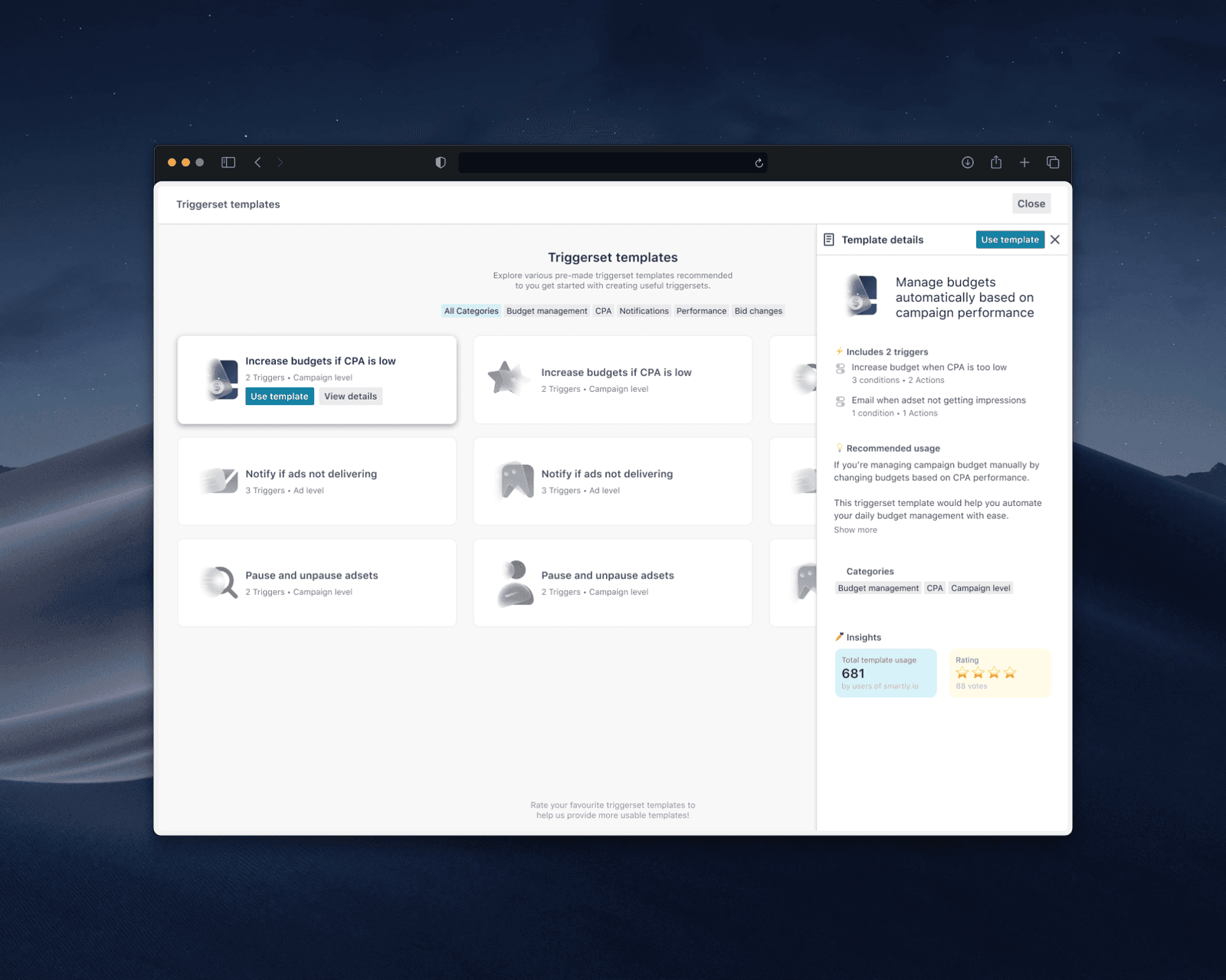
Templates for first-time users:
Fast onboarding without limiting advanced users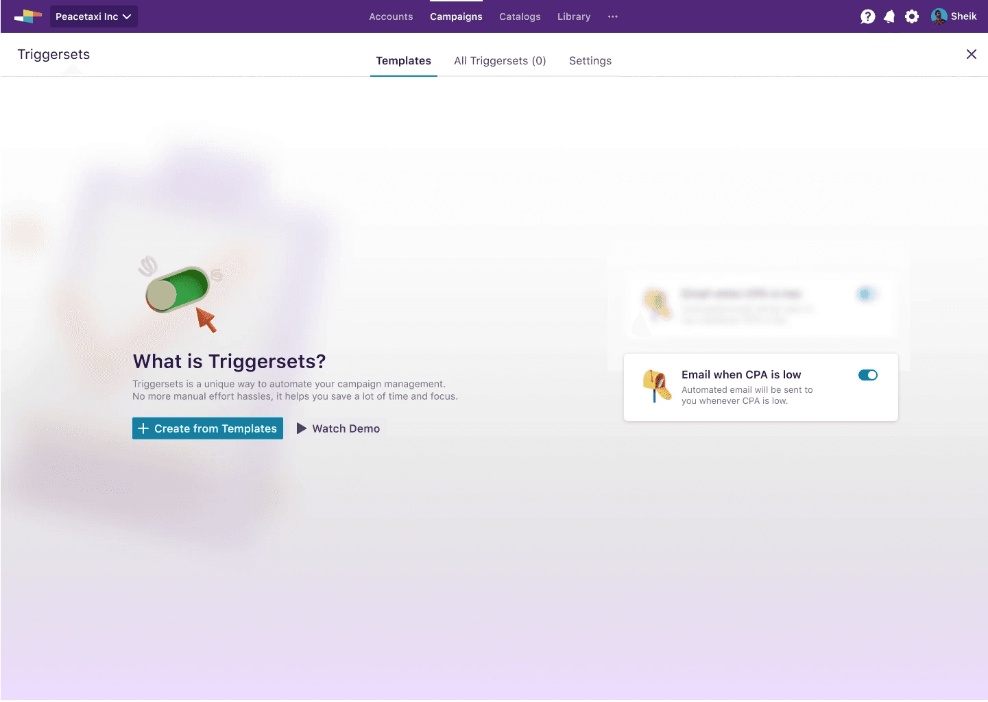
Impact & Validation
The redesign spanned 18 months, navigating shifting OKRs and multiple leadership transitions. Clear documentation of decisions and trade-offs ensured continuity and prevented rework when the initiative resumed.
Post–General Availability impact (Year 1):
~20% increase in feature usage
~60% reduction in automation-related support queries
~6% increase in customer spend managed through the feature, resulting in several hundred thousand dollars in incremental revenue during the first year after GA. Resulting in my promotion and key responsibility shift in the organization.
For a capability centered on budget control and performance optimization, increased spend routed through the feature was the strongest indicator of restored trust and value.
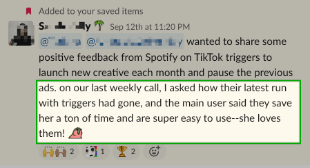
One of our largest enterprise customers — Spotify - a leading Swedish music streaming company — has relied on the redesigned automation for over a year, steadily increasing budget allocation through it.
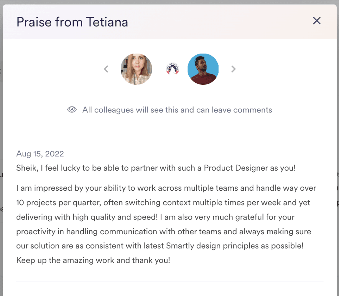
Internal validation was equally strong, with Product leadership recognizing the redesign as a foundational shift from legacy constraint to scalable infrastructure.
Key Learnings
-
Continuity must be designed.
Structured documentation preserved intent through multiple PM and engineering changes. -
MVP scoping defines long-term quality.
Explicitly tracking usability debt prevented short-term trade-offs from becoming permanent compromises. -
User empathy requires exposure.
Bringing engineers into customer conversations improved decision quality and execution. -
Design impact must be instrumented.
Partnering early on analytics enabled measurable outcomes and stronger strategic alignment.